6 min readUpdated 6 October 2026
Everfield draws your product options in a bordered box on your storefront, and you style that box from two tabs in the builder: Templates and Style. This guide covers applying a ready-made style, tuning the settings by hand, and checking the result on desktop and mobile. Allow about ten minutes. Styling is available on every plan.
Start from a style template
A template is a complete set of Style settings in one click — the fastest way to get close to your theme before fine-tuning.
- Open your experience in the builder and click the Templates tab.
- Scroll the five templates — Editorial, Soft & Rounded, Bold Contrast, Luxe Serif and Compact Clean. Each card shows a live thumbnail rendered by the same engine that builds the storefront widget, so what you see is what ships.
- Click Apply template on the one you want. Applying replaces every Style setting — including the Visibility toggles and anything you have written into Custom CSS — while keeping your fields and placement, and it can be undone. The template you are using is marked with an Active badge and its button reads Applied. That match is made on a handful of signature values (card background, border colour, corner radius, font and accent), so a template can keep its Active badge after you tweak other settings by hand.
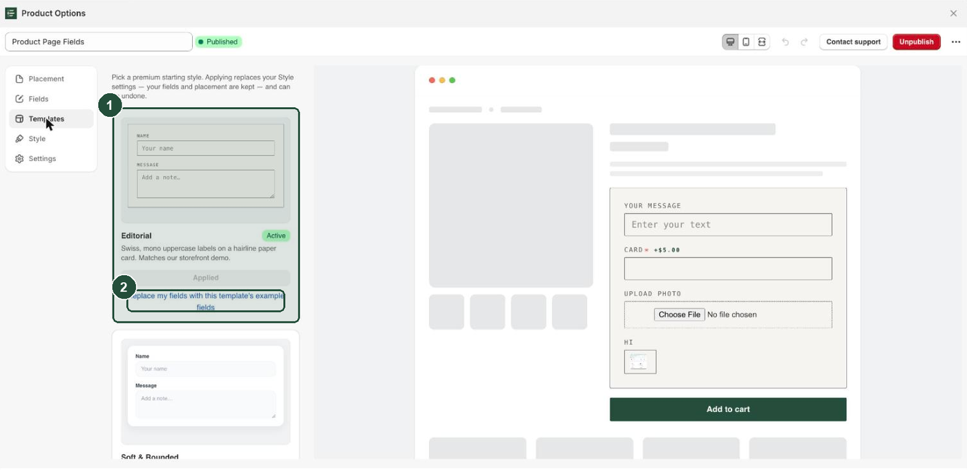
Only Editorial ships example fields. If your experience still has nothing but the default field, Editorial's button reads Apply template + example fields and seeds a recipient name and a gift message for you; the other four templates always read Apply template and never touch your fields. If you have already built your own fields, Editorial instead shows a separate plain link, Replace my fields with this template's example fields, which does throw them away — so use Apply template unless you want that. Applied one by mistake? Click the undo arrow at the top right, next to the device buttons, before you save.
When you are happy, click Save. If the badge reads Published, saving pushes the new styling to your storefront. If it reads Draft, click Publish — styling only reaches the storefront for published experiences.
The Style tab section by section
Click the Style tab. It has six collapsible sections: Visibility, Layout, Container, Labels & typography, Inputs and Custom CSS. There is no button section: the widget has no button of its own, because answers attach to the cart when the customer clicks your theme's Add to cart or checkout button. Style that button in your theme editor.
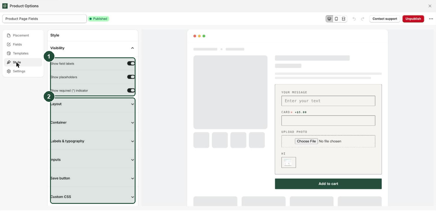
Layout sets the shape of the box: Width (280–700 px), Corner radius, Padding, and Field spacing, which is the gap between one field and the next. Width is a maximum, not a fixed size — on a narrow screen the box shrinks to fit.
Container is the box itself: Background, Border color, Border width, and Shadow (None, Subtle, Medium or Elevated).
Labels & typography covers the text above each input: Label color, Label size, Label weight (Regular, Medium, Semibold, Bold), Label & input font, Label case (As typed, UPPERCASE, Capitalize) and Label letter spacing (Normal, Wide, Wider, Widest). Label & input font applies to both the labels and the text customers type — leave it on Theme default to inherit your theme's font, or pick Monospace, Serif or System sans.
Inputs covers the boxes customers type in: Input background, Input text, Placeholder color, Input border, Focus border, Input corner radius, Input font size, Input vertical padding and Input horizontal padding. Focus border does more work than its name suggests — the same colour is reused as the accent for radio buttons, the switch on a toggle field, the outline on a selected swatch, the size-chart link and any price you show, so set it to your theme's accent colour.
Custom CSS is collapsed by default and is covered below.
Hide labels, placeholders or the required marker
The Visibility section at the top of the Style tab has three toggles, all on by default.
- Show field labels — off removes the label text from the widget only. The field's Label is still the name the answer is saved under on the cart line and the order, so keep labels meaningful even when hidden. A field-level Add-on price tag sits beside the label, so it is hidden too.
- Show placeholders — off removes the grey hint text inside empty inputs. Dropdowns always show Select… as their first option either way.
- Show required (*) indicator — off removes the red asterisk only. Required fields stay required: a customer who leaves one empty still sees the error (This field is required., or Please upload an image. on a file field) and cannot add to cart.
Check desktop and mobile
The preview on the right is built by the same code as the live widget, and it is interactive — conditional rules and add-on price totals run inside it as you click.
- Find the three icon buttons at the top right: desktop, mobile and full width.
- Click the middle one to switch the preview to a phone frame roughly 390 px wide.
- Check the fields still breathe at that width. If they look cramped, reduce Padding and raise Field spacing in Layout.
- Click the first button to go back to desktop.
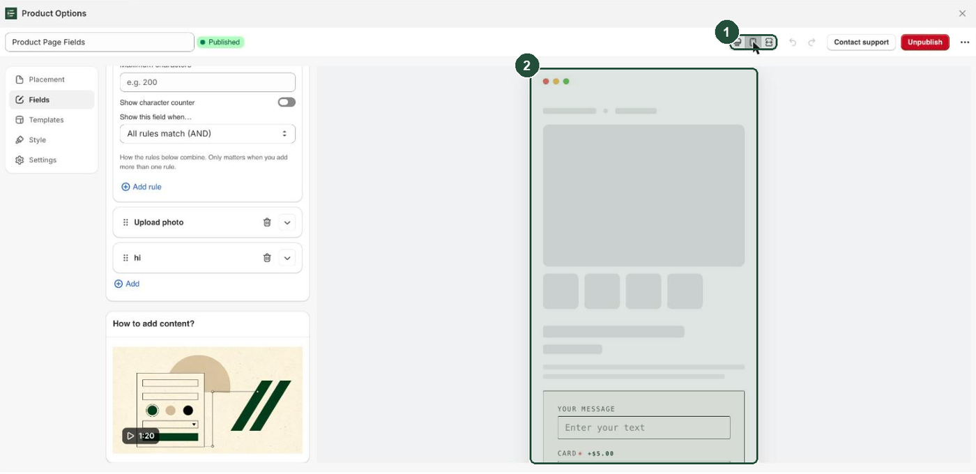
The mock Add to cart button in the preview is scenery — it is not part of what Everfield puts on your storefront. And if Label & input font is set to Theme default, the widget inherits whatever font surrounds it: the Shopify admin font in the preview, your theme's font on the storefront. Take a final look at a real product page after publishing.
Custom CSS
If the settings above do not reach far enough, open the Custom CSS section and write your own rules. They are appended after Everfield's generated CSS, so they can override anything.
Everything Everfield generates is prefixed npi- and wrapped in a .npi-widget-<id> container, so the app's styles cannot leak into the rest of your theme. The classes you are most likely to target:
| Class | What it is |
|---|---|
.npi-field | One field, label and input |
.npi-label | A field label |
.npi-req | The required asterisk |
.npi-input / .npi-textarea | The input boxes |
.npi-help | Help text under a field |
.npi-error | A validation message |
.npi-check-group | A multiple choice or radio group |
.npi-swatch | One swatch |
.npi-upload-area | The upload drop zone |
For example:
.npi-label { letter-spacing: 0.08em; }
.npi-input:focus { box-shadow: none; }
Your custom CSS is compiled into the live preview as well as the storefront, so you can see what a rule does before you publish. It is added exactly as you type it, though, and is not scoped or validated for you, so start every rule with an npi- class. A bare selector like p { } applies to the whole page, not only the widget. Save, publish, then check the real product page too — your theme's own CSS is not in the preview.
Troubleshooting
You restyled the experience but the storefront looks the same. Styling is compiled to your storefront when you save a published experience. Check the badge at the top of the builder: if it reads Draft, click Publish. If it reads Published, click Save, then hard-refresh the product page to get past browser and theme caching.
The widget looks right in the preview but different on the storefront. Usually the font: Label & input font on Theme default inherits the admin font in the preview and your theme's font live. Pin it to Monospace, Serif or System sans to make them match. Otherwise your theme's own CSS is styling inputs broadly enough to reach inside the widget — override it in Custom CSS.
You applied a template and lost your styling. Click the undo arrow at the top right before saving. Remember that a template replaces the whole Style tab, so anything you had in Custom CSS goes with it. If you already saved, apply another template or set the values again — there is no version history.