12 min readUpdated 6 October 2026
Everfield has 20 field types: 14 that collect an answer from the customer, and 6 display-only blocks that format the widget without asking for anything. This reference explains what each field type shows the buyer, which settings it offers, and where the differences catch people out. Use it as a lookup — you don't need to read it end to end.
How to change a field type
Every new field starts as Text. Changing it takes a few seconds, and the settings underneath swap to match the type you pick.
- Go to Apps → Everfield - Product Options and open the experience you want to edit.
- Click the Fields tab.
- Click the chevron on the right of a field row to expand it.
- Open the Field type dropdown and choose a type.
- Click Save, then Publish.
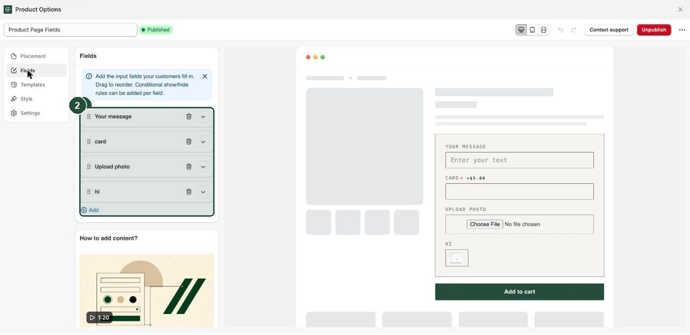
An experience holds up to 20 fields, and you can drag the rows into any order.
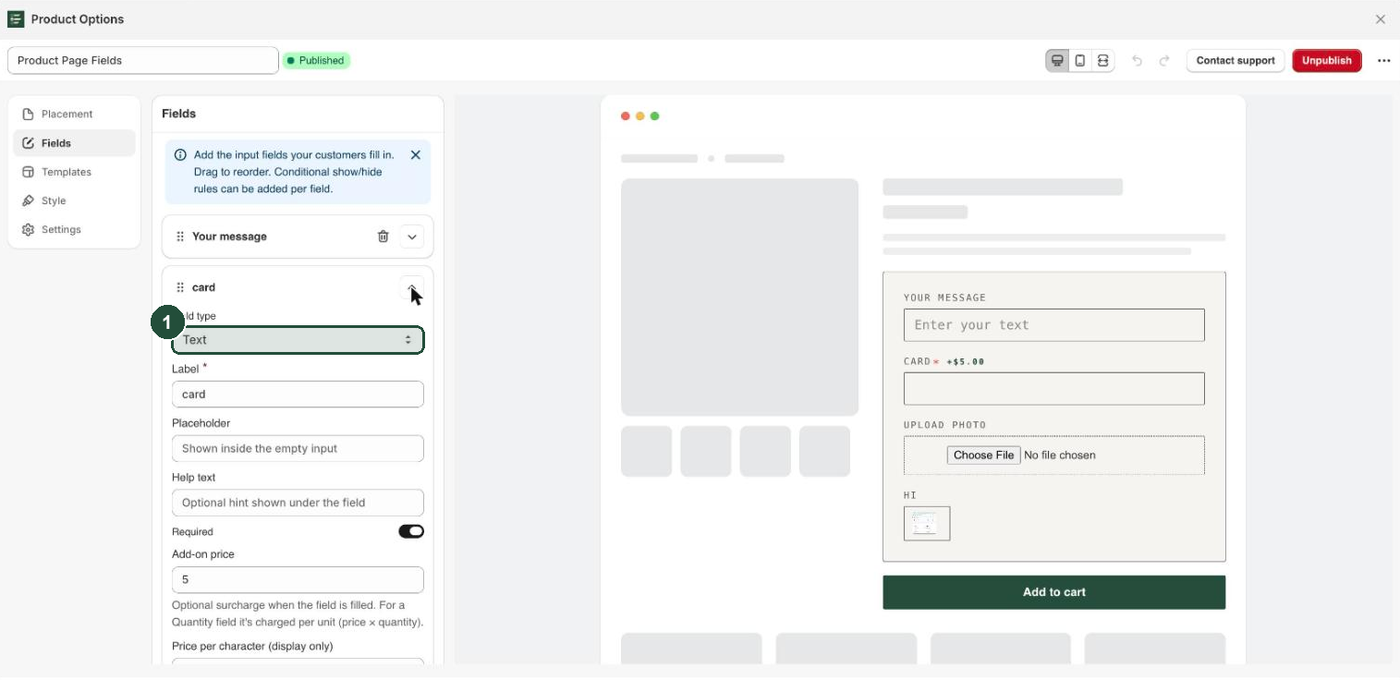
Two settings appear on every field, whatever type it is: Field type and Label. The 14 input types also get Help text and Required. The 6 display blocks get neither, because they collect nothing.
The Field type dropdown lists the types in this order: Text, Text area, Number, Quantity, Phone, Email, Date, Dropdown, Radio buttons, Swatch, Toggle / switch, File / image upload, Multiple choice, Product picker, Heading, Paragraph, Divider, Spacer, Custom HTML, Size chart.
Text and long-form input
Text is a single-line box. Text area is a multi-line box, three rows tall. Both offer the same extras:
- Placeholder — the grey prompt shown inside the empty box.
- Minimum characters and Maximum characters.
- Show character counter — a live count under the box. It reads
12 / 200when you've set a maximum, and only the number typed when you haven't.
If a customer types fewer than the minimum, add to cart is blocked with "Please enter at least N characters."
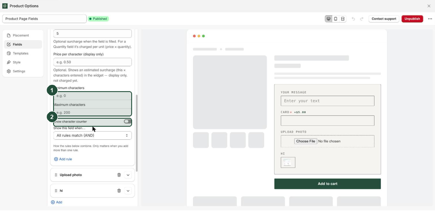
These two types are also the only ones with Price per character. It charges the amount you enter for every character typed, shows the running total in the widget, and can be combined with a flat Add-on price on the same field. See Charge for options.
Numbers and quantities
Number renders a numeric input and offers Minimum value, Maximum value and Step, which are applied to the input itself so the stepper moves in your increments.
Quantity is for "how many" — extra gift boxes, spare buttons, additional prints. Three things are worth knowing before you use it:
- It has no minimum, maximum or step settings of its own. Every Quantity field starts at
0and steps by 1. 0does not count as an answer. Marking a Quantity field Required blocks add to cart with "This field is required." until the customer raises it above0.- Its Add-on price is charged per unit — price × quantity. On every other type a flat add-on price is charged once.
Number offers a Placeholder. Quantity does not.
Choice fields: dropdown, radio, swatch, multi-select
Four types present a list of choices you write yourself: Dropdown, Radio buttons, Swatch and Multiple choice. All four share the Choices list, with an Add choice button and a cap of 30 choices per field.
Each choice row has:
- Label — what the customer sees.
- Value (optional) — what gets saved to the order. Leave it empty and the value falls back to the label, as the placeholder says: "Defaults to the label". Use it when your internal code differs from the buyer-facing wording.
- Add-on price — a surcharge added when that choice is selected.
Choice fields have no field-level Add-on price box. They price each choice separately instead.
Which one to use:
- Dropdown — one answer from a long list, in the least space. The empty first option always reads
Select…; that prompt is fixed and can't be edited. A priced choice shows its surcharge inline, likeGift wrap (+$5.00). - Radio buttons — one answer, every option visible at once. Good for three or four choices.
- Swatch — one answer, shown visually. Swatch style offers
Color(a colour chip),Image(a thumbnail) orButton(a labelled pill). Colour swatches use the per-choice Swatch color; image swatches use Swatch image. There's no warning if you miss one: a colour swatch with no colour renders white, and an image swatch with no image renders an empty chip. - Multiple choice — checkboxes, any number of answers, joined with commas into one saved answer. Only this type has Min selections (0 = none) and Max selections (0 = unlimited). Once the maximum is reached the remaining boxes are disabled. Setting Max selections to
1gives you a pick-one question that still looks like checkboxes — that's how the shipped Engraving template works.
Dates, toggles, phone and email
Date shows a date picker with five limits:
- Lead time (days from today) — "Earliest selectable date is this many days ahead. 0 = today."
- Earliest date (YYYY-MM-DD) — "Optional hard floor. The later of this and the lead time wins."
- Latest date (YYYY-MM-DD).
- Closed weekdays — days of the week customers can't pick, typed as names separated by commas:
Sat, Sun. A range works too:Mon-Wed. - Unavailable dates (YYYY-MM-DD) — specific dates customers can't pick, such as holidays or days you are fully booked, separated by commas or new lines. For a run of days write
2026-12-24 to 2026-12-31. A field holds up to 366 unavailable dates.
The lead time is recalculated against the real date on every page load, so a made-to-order window keeps blocking past dates long after you published it. It counts calendar days, not working days, so it does not skip your closed weekdays.
Closed weekdays and unavailable dates still appear in the browser's date picker, because a browser picker can't grey out single days. A customer who picks one sees "That date isn't available. Please choose another." straight away and the field is emptied, so a closed date is never saved to the cart. On a Required date field that also blocks add to cart until they pick an open date. An entry Everfield can't read — a misspelt day, a date in another format — is ignored without a warning, so check the spelling and the YYYY-MM-DD form, then test the field on your storefront.
These are limits on which date can be chosen. Everfield has no delivery slots, order cutoff times or per-day order caps.
Toggle / switch is an on/off switch. Its only extra is Value when on — the text saved to the order when the customer switches it on, which defaults to Yes. Switched off it saves nothing, so the field is left off the order entirely. Marking a toggle Required therefore means "must be switched on".
Phone shows a country-code dropdown next to the number box. The list covers 25 countries and is pre-selected to the visitor's country where that can be detected. The saved answer is the dial code and the number with a space between them, like +1 5551234.
Email checks the format when the customer adds to cart and shows "Please enter a valid email address." if it doesn't look like one. It has no other settings of its own.
All four accept a flat Add-on price. Phone and Email also offer a Placeholder; Date and Toggle / switch don't.
File and image uploads
File / image upload lets the customer attach a file. Everfield uploads it to your Shopify Files and saves the resulting link as the answer.
Its settings are:
- Allowed file types —
Images only,Documents (PDF, Word, etc.),Archives (zip, rar)orAny file type. - Allow multiple files — off by default.
- Max number of files — only applied when multiple files are allowed.
- Max file size (MB) — a slider from 1 to 5, default 5. That ceiling is Everfield's own, not Shopify's; see Let customers upload a photo with their order.
Going over the limits shows "Please select at most N file(s)." or "Each file must be under NMB.", and add to cart is blocked while an upload is still running. A missing required upload shows "Please upload an image." rather than the usual "This field is required."
For the full walkthrough, see Collect image uploads.
Product picker
Product picker shows the products you've chosen as a grid of small tiles — each with its image, title and price — and the customer picks one. Its only setting is Selectable products ("Products the customer can choose from").
Each product's title, image and price are baked in when you publish, so re-publish after changing any of them in Shopify. The answer saved to the order is the product's ID, not its name, and picking a product does not add it to the cart — the field records a choice. An empty list shows "No products configured."
Display-only blocks
Six types collect nothing at all. They exist to lay out and explain the rest of the widget, and none of them puts anything on the order or offers Help text, Required or a price.
- Heading — a bold line of text taken from Content, falling back to the field's Label when Content is empty.
- Paragraph — smaller grey explanatory text from Content. HTML here is shown as plain text.
- Divider — a horizontal rule. It has no settings of its own; its Label only names the row in the builder and is never shown to the customer.
- Spacer — blank vertical space. Spacer height is a slider from 4 to 120 px, default 16.
- Custom HTML — your own markup from Content, injected exactly as written. It is not escaped, so treat it like theme code and only paste HTML you wrote or trust.
- Size chart — a button labelled with the field's Label (or "Size chart" when that's blank). Clicking it reveals a panel inline on the page, not a pop-up, holding the optional Size chart image and whatever you put in Content. Content is injected raw here too, which is how you get a real sizing table in.
Display blocks still take conditional rules, so you can show a note or a heading only when a particular option is selected. Rules need the Basic plan or higher — see Show and hide fields with rules.
Which settings each type offers
Every input type has Label, Help text, Required and conditional rules. The table lists what each type adds on top.
| Field type | What it collects | Notable settings |
|---|---|---|
| Text | One line of text | Placeholder, Minimum characters, Maximum characters, Show character counter, Add-on price, Price per character |
| Text area | Several lines of text | Same as Text |
| Number | A number | Placeholder, Minimum value, Maximum value, Step, Add-on price |
| Quantity | A whole number, starting at 0 | Add-on price (charged per unit) |
| Phone | Dial code plus number, e.g. +1 5551234 | Placeholder, Add-on price |
| An email address, format-checked | Placeholder, Add-on price | |
| Date | A calendar date | Lead time (days from today), Earliest date (YYYY-MM-DD), Latest date (YYYY-MM-DD), Closed weekdays, Unavailable dates (YYYY-MM-DD), Add-on price |
| Dropdown | One choice from a list | Choices (up to 30), each with Value (optional) and Add-on price |
| Radio buttons | One choice, all options visible | Choices (up to 30), each with Value (optional) and Add-on price |
| Swatch | One choice, shown as a chip, thumbnail or pill | Swatch style, Choices with Swatch color / Swatch image and Add-on price |
| Toggle / switch | On or off | Value when on, Add-on price |
| File / image upload | One or more uploaded files | Allowed file types, Allow multiple files, Max number of files, Max file size (MB), Add-on price |
| Multiple choice | Any number of ticked choices, comma-joined | Choices, Min selections (0 = none), Max selections (0 = unlimited), per-choice Add-on price |
| Product picker | One product from a list you set | Selectable products |
| Heading | Nothing — display only | Content |
| Paragraph | Nothing — display only | Content |
| Divider | Nothing — display only | None |
| Spacer | Nothing — display only | Spacer height |
| Custom HTML | Nothing — display only | Content (raw HTML) |
| Size chart | Nothing — display only | Content (raw HTML), Size chart image |
Two patterns are worth committing to memory:
- Placeholder is offered on five types only: Text, Text area, Number, Phone and Email.
- The flat Add-on price is offered on nine types only: Text, Text area, Number, Quantity, Phone, Email, Date, File / image upload and Toggle / switch. The four choice fields price each choice instead, and Product picker has no pricing at all.
Only the second list changes on a cart experience. Cart-placement widgets can't attach add-on charges, so every pricing box — the field Add-on price, Price per character and the per-choice Add-on price — is hidden there. Placeholder is unaffected and still appears on the same five types — see Add options to the cart.
Troubleshooting
The Placeholder box has disappeared. It's only shown for Text, Text area, Number, Phone and Email, so changing the type to anything else removes it. Use Help text for a hint under the field instead.
There's no Add-on price on my Dropdown. Choice fields price per choice, not per field. Expand the choice inside Choices and set its Add-on price there.
My dropdown's first option says Select… and I can't change it. That prompt is fixed. If you need different wording, put it in the Label or Help text, or use Radio buttons instead.
Customers can't add to cart until they change a Quantity field. A required Quantity field starts at 0, and 0 does not count as an answer, so add to cart is blocked with "This field is required." until the customer picks at least 1. If 0 is a valid answer for you, switch Required off.
The surcharge shows on the product page but the cart total doesn't change. A price only charges once Everfield has set up an add-on for that exact label and amount, so save the experience again after changing a price — a published experience rebuilds its storefront copy (and sets up the add-on) on Save; a draft needs Publish. See Charge for options. The same applies to Price per character.
All my pricing boxes vanished. You're editing a cart experience. Cart widgets can't attach add-on charges, so the field price, per-character price and per-choice price boxes are removed there. Move priced fields to a product-page experience.
Two fields overwrite each other on the order. The Label is the name the answer is saved under, so two fields sharing a label collide and only one survives. Give every field a distinct label. Renaming a field also renames the property on new orders, and breaks any rule pointing at it by label.
My swatch shows white or empty circles. A Color swatch with no Swatch color renders white, and an Image swatch with no Swatch image renders an empty chip. Open Choices and fill in the missing value.