8 min readUpdated 4 August 2026
A size chart, a note about production times, a line between two groups of options — none of these ask the customer for anything, and all of them are built with Everfield display blocks. There are six, they live in the same Fields list as your inputs, and each takes about a minute to set up.
What a display block is
A display block is a field type that shows something instead of collecting something. It renders inside your options widget, but there is no input for the customer to fill in.
Because a display block collects nothing:
- It puts nothing on the order — no line item property, no cart attribute. (The one exception is a Custom HTML block whose markup contains a form control of its own; see the warning below.)
- It has no Help text and no Required toggle. Those two are offered on the 14 input types only.
- It has no Add-on price either. That box is narrower still — it appears on nine input types (Text, Text area, Number, Quantity, Phone, Email, Date, File / image upload and Toggle / switch). The four choice types price per choice instead, and Product picker has no pricing at all.
- It can never block add to cart. Validation skips display blocks entirely, so there is nothing to fail.
Everything else works the same as a normal field. Display blocks sit in the Fields list, drag into position with the same handle, and count towards the 20-field limit of an experience.
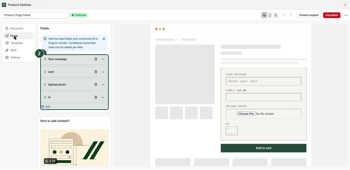
Every field needs a Label, display blocks included, but each type uses it differently. Heading falls back to it when Content is empty, and Size chart uses it as the button text. On Paragraph, Divider, Spacer and Custom HTML it is never shown to the customer — it names the row in the builder, so use something you will recognise, like Divider above sizing. Leave it blank and the row is titled Item 3 instead, which gets confusing fast.
The six display blocks
| Block | What the customer sees | Its own settings |
|---|---|---|
| Heading | A bold line of text, slightly larger than the text around it | Content |
| Paragraph | Small grey explanatory text | Content |
| Divider | A thin horizontal line in your container border colour | None |
| Spacer | Blank vertical space | Spacer height |
| Custom HTML | Whatever markup you write | Content |
| Size chart | A link-styled button that reveals a chart on the page | Content, Size chart image |
Four of the six share one Content box, whose placeholder reads "Text to display (raw HTML allowed for Custom HTML)". Divider and Spacer have no content at all.
Add a size chart
Size chart gives you a button that sits wherever you drag the row. Clicking it reveals an image, an HTML table, or both, on the page itself — an inline reveal, not a pop-up window. Clicking again closes it.
- Go to Apps → Everfield - Product Options and open the experience you want to edit.
- Click the Fields tab.
- Click Add. A new field row appears at the bottom of the list, already expanded.
- Open the Field type dropdown and choose Size chart.
- In Label, type the button text your customers will click, for example
Size chart. The builder marks Label required and uses it to name the row, so always fill it in — if it is ever empty, the button falls back to reading "Size chart". - Under Size chart image, click Add image and pick your chart file. It uploads to your Shopify files and comes back as a thumbnail with a Replace button and a delete icon beside it. Accepted formats are PNG, JPG, GIF, WebP and SVG, up to 5 MB.
- For a real table rather than a picture, paste your table markup into Content. The widget gives the table full width, and each cell a 1px border in your container border colour at 13px text, so plain
<table>markup looks tidy without extra CSS. - Drag the row by its handle to where the button should sit — usually under the size option.
- Click Save, then Publish if the experience is still a draft.
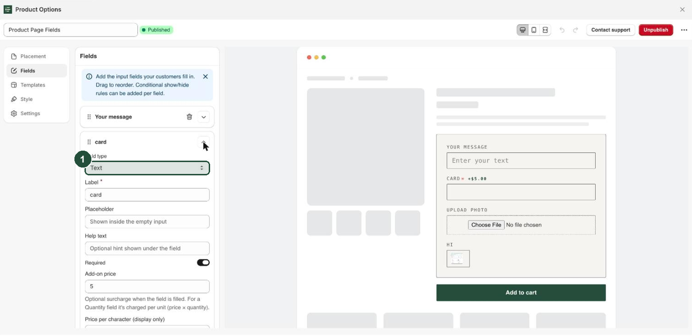
Image and table work together: the image renders first, the table below it. Fill in neither and the button still appears, revealing an empty panel. Content on a size chart is injected exactly as you write it, the same as Custom HTML — read that warning before pasting markup from elsewhere.
The button itself is styled as a link: underlined, at 13px, in the Focus border colour from the Inputs section of the Style tab.
Headings and paragraphs
You will reach for these two most, usually as a pair: a Heading that names a group of options, and a Paragraph that explains it.
- Heading renders bold at 1.15× the widget's base text size — that is Input font size under Inputs on the Style tab, not Label size — in your Label color. It takes its text from Content and falls back to the field's Label when Content is empty, so filling in only the Label is enough.
- Paragraph renders at 13px in a fixed grey, so it reads as a note rather than as an option. That grey is baked in; the Style tab does not change it.
Both are plain text. HTML typed into a Heading or a Paragraph shows on the storefront as the tags themselves, not as formatting. For a link or bold text mid-sentence, use Custom HTML instead.
Try a Personalisation heading above your engraving fields, or a paragraph reading "Made to order — allow 5 working days before dispatch" above a date field.
Dividers and spacers
Both exist to break up a long widget, and both work well directly above a Heading when you group options into sections.
Divider draws a horizontal line in the same border colour as your options container, so it follows the Border color setting under Container on the Style tab. It has no settings of its own — add it, label it for your own reference, and drag it into place.
Spacer adds blank vertical space. Its only setting is Spacer height, a slider from 4 to 120 px in steps of 2, set to 16 px by default. Use it when a divider is too heavy a break but your fields still feel crowded.
Custom HTML
Custom HTML renders the markup in Content exactly as you wrote it, with no escaping and no cleaning. That is what makes it useful — a styled callout, a link to your care instructions, an icon row — and it is also the one field where a mistake can break the layout of the whole widget. An unclosed <div>, a stray <style> rule or a wide fixed-width element affects the fields around it, and on some themes the rest of the product page too.
Treat it like theme code:
- Only paste markup you wrote or trust. It goes onto your live storefront unescaped, at the same trust level as theme code or custom CSS.
- Keep it small and self-contained.
- Avoid putting an
<input>,<select>or<textarea>inside it. A display block is not meant to collect anything, but a form control sitting in a Custom HTML block will have its value picked up and saved to the cart under that block's Label. If you want an answer recorded, use a real input field so it validates and behaves predictably. - Check the live preview after every change, and a real product page after you publish.
For a plain line of explanation use Paragraph instead. It cannot break anything.
Display blocks and conditional rules
Display blocks take conditional rules exactly like input fields do. Each has the same Show this field when… dropdown, offering All rules match (AND) and Any rule matches (OR), and the same Add rule button, capped at 5 rules per field.
That is how you make an explanation appear only when it matters — a paragraph about engraving lead times that shows once Add engraving? is answered Yes. Conditional rules need a paid plan, Basic or above. Full instructions are in Show a field only when it is relevant.
Troubleshooting
Nothing from your display blocks appears on the order. That is expected — they collect nothing, so there is no value to save. To record an answer, use an input field: see Every Everfield field type explained.
There is no Required or Help text on a display block. Those are offered on the 14 input types only. A display block asks the customer for nothing, so there is nothing to require or hint at.
There is no Add-on price on a display block. Same reason, and that box is narrower still — it only appears on Text, Text area, Number, Quantity, Phone, Email, Date, File / image upload and Toggle / switch. Choice fields are priced per choice instead. See Charge extra for an option.
The size chart button does nothing in the customizer preview. The preview runs your conditional rules and price totals, but not the size-chart reveal. Publish, then click the button on a real product page to check it.
Your HTML shows on the storefront as tags instead of formatting. It is in a Heading or a Paragraph, which show their content as plain text. Move the markup to a Custom HTML block, or into the Content box of a Size chart.
The widget layout broke after you added Custom HTML. The markup renders as written, so a broken tag affects everything around it. Delete the block and click Save to restore the widget, then add the markup back a piece at a time.
The Add button is greyed out. An experience holds 20 fields, and display blocks count towards that. Delete a block you are not using.
Your changes aren't on the storefront. Display blocks are compiled into the widget when you save a published experience. Check the badge next to the experience name: if it reads Draft, click Save and then Publish. If it already reads Published, clicking Save is enough — the primary button now reads Unpublish, and pressing it would take the whole experience down. Then reload the product page. If nothing shows at all, check My options aren't showing.