8 min readUpdated 4 August 2026
Everfield gives you four ways to offer a shopper a list to pick from: a dropdown, radio buttons, colour or image swatches, and multiple choice checkboxes. All four are built the same way — you write a list of choices, and the customer's pick is saved to the order. This guide covers which type to use, how to fill in the choices, and how swatches get their colours and images.
When to use a choice field instead of a variant
A Shopify variant and an Everfield choice field look alike to a shopper, but they do different jobs.
A variant is a real thing in your catalogue: its own SKU, inventory count, price and image, and Shopify decrements its stock when it sells. A choice field only records an answer. The pick is saved on the order as a line item property under the field's Label — nothing is stocked, counted or reserved. If a choice costs extra, Everfield collects it through a hidden add-on line in the cart rather than by changing the product's price. (Your Settings → Paid options card decides whether that add-on line is shown on its own or folded into the product line, which is the default.)
So use variants when you need stock tracking or per-option SKUs. Use a choice field when the option doesn't affect inventory — gift wrap, thread colour, a font, a delivery slot — or when the combinations would be unmanageable as variants.
The two work side by side: a choice field sits alongside your theme's variant picker, and a rule can show a field only for one variant. Rules need the Basic plan or higher. See Show and hide fields with rules.
The four choice field types
All four share the same Choices list. They differ only in how the list is drawn and how many answers a customer can give.
| Field type | Customer picks | Best for |
|---|---|---|
| Dropdown | One | Long lists, in the least space |
| Radio buttons | One | Three or four options, all visible at once |
| Swatch | One | Colours, materials, patterns — anything visual |
| Multiple choice | Any number | Add-ons and extras that combine |
Three differences worth knowing. Dropdown always starts with an empty prompt option reading Select…, and that wording is fixed; a priced choice shows its surcharge in the option text, like Gift box (+$5.00). Swatch shows a colour chip, a thumbnail or a labelled pill, depending on Swatch style. Multiple choice joins every ticked box into one answer separated by commas — three ticks save as Ribbon, Card, Gift box.
To set a field to one of these types:
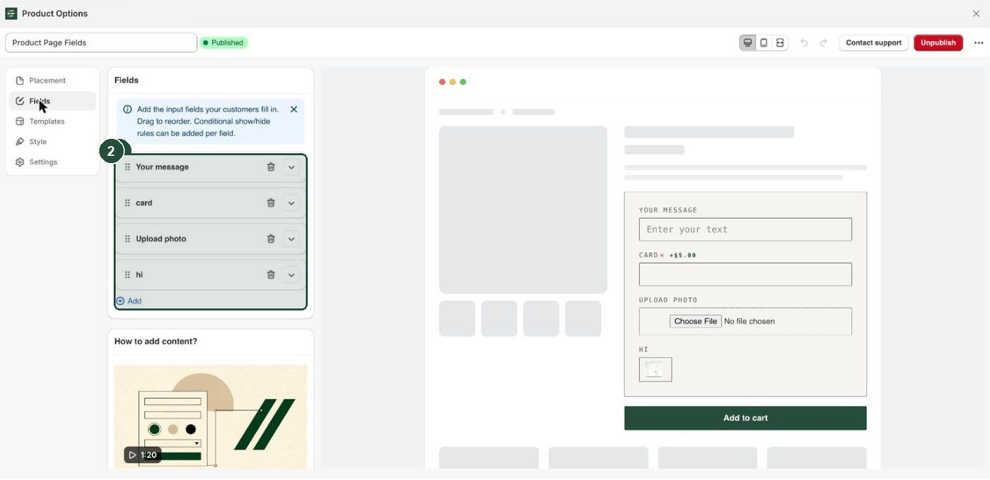
- Go to Apps → Everfield - Product Options and open the experience you want to edit.
- Click the Fields tab.
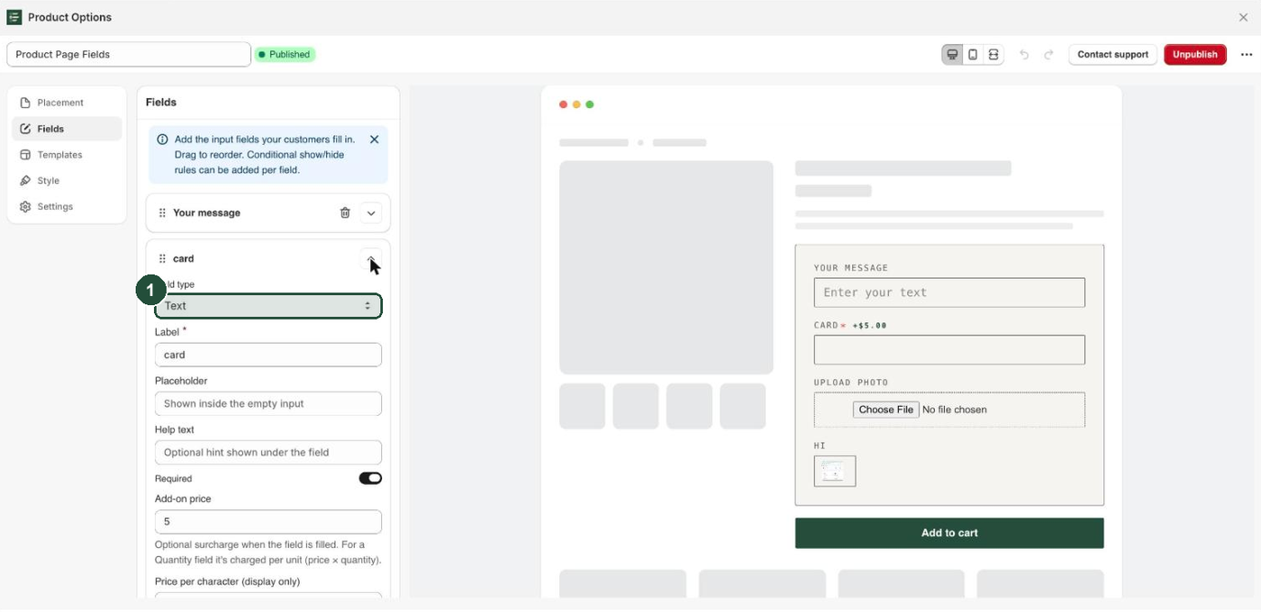
- Click the chevron on the right of a field row to expand it, or click Add to create a new field.
- Open Field type and choose Dropdown, Radio buttons, Swatch or Multiple choice.
Add your choices
Once the type is one of the four, a Choices list appears under the field's settings.
- Click Add choice. A new choice row opens.
- Type what the customer should see into Label. Its placeholder reads "e.g. Red".
- Leave Value (optional) empty unless you need a different answer saved to the order.
- Repeat for each choice, and drag the rows to reorder them.
- Click Save. On a draft experience, click Publish after the save — the button only offers Publish once there is nothing left to save. On an experience that is already published, the save is enough: it rebuilds your storefront copy straight away.
A field holds a maximum of 30 choices — Add choice greys out there — and a minimum of one, so the last remaining choice can't be deleted. Change its Label instead, or delete the whole field.
Label versus value
Each choice row has two text boxes that sound alike:
- Label is what the shopper reads on the product page. It is required.
- Value (optional) is what gets written to the order. Its placeholder says "Defaults to the label", and that is exactly what happens — leave it empty and Everfield saves the label.
Use Value (optional) when your internal wording differs from your storefront wording. A choice labelled Midnight Navy with the value NVY-02 shows the shopper the pretty name and puts your warehouse code on the order.
The answer is filed under the field's Label, not the choice's. Two fields in one experience sharing a label overwrite each other on the order, so give every field a distinct label. See Find answers on your orders.
Colour and image swatches
Set Field type to Swatch and one extra setting appears above the list: Swatch style, which defaults to Color. The app describes the three options as "Color shows a colour chip, Image shows a thumbnail, Button shows a labelled pill."
Two boxes also appear inside every choice row, and only on a Swatch field:
- Swatch color ("Used by color-style swatches.") — click the coloured dot to pick a colour, or type a hex code like
#1F2A44. An invalid code shows "Invalid color format. Use #RRGGBB format." - Swatch image ("Used by image-style swatches.") — click Add image and choose a file from your computer. It uploads straight to your Shopify Files and a thumbnail appears in the row; Replace swaps it and the bin icon clears it. You no longer need to paste an image URL. Anything that isn't a PNG, JPG, GIF, WebP or SVG is rejected with "Invalid file type. Allowed: PNG, JPG, GIF, WebP, SVG", and anything over 5 MB with "File too large. Maximum size is 5MB".
Fill in whichever box matches your Swatch style. Everfield does not warn you when one is missing: a Color swatch with no colour renders as a white chip, and an Image swatch with no image renders as an empty one.
Pricing an individual choice
Choice fields have no field-level Add-on price box. That's deliberate — you price each choice on its own, so Standard wrap stays free while Gift box costs 5.00.
- Expand a choice row under Choices.
- Type the amount into that row's Add-on price. Its help text reads "Optional surcharge added when this choice is selected." Numbers only, no currency symbol — blank, zero and negative amounts are ignored.
- Leave the box empty on free choices.
- Click Save, then Publish if the experience is still a draft. On an experience that is already published, the save is enough.
On Dropdown, Radio buttons and Swatch, only the selected choice is charged. On Multiple choice, every ticked paid box adds up. A running "Add-ons" total shows in the widget in your store's active currency. The surcharge printed next to each individual choice is a different thing: it is baked in at publish time and always written with a $, so on a non-USD store only the running total carries your currency.
Two limits: per-choice pricing exists on product-page experiences only, since a Cart Fields experience has no price boxes at all, and a price only charges once publishing has set up the matching add-on. Until then the surcharge shows but nothing is collected. Both are covered in Charge for an option.
Limiting how many a customer can pick
Dropdown, Radio buttons and Swatch allow exactly one answer, so there is nothing to configure. Multiple choice is the only type with limits:
- Min selections (0 = none) — the fewest boxes a customer must tick.
- Max selections (0 = unlimited) — the most they can tick. Once the maximum is reached, the remaining boxes are disabled.
Adding to cart below the minimum or above the maximum is blocked with "Please select at least N." or "Please select at most N."
Setting Max selections to 1 turns a Multiple choice field into a pick-one question that still looks like checkboxes — that's how the shipped Engraving template works. For a single choice that looks single, use Radio buttons.
To make any choice field compulsory, turn on Required. An empty one blocks add to cart with "This field is required." See Required fields and validation.
Troubleshooting
There's no Add-on price box on your Dropdown or Swatch. Choice fields price per choice. Expand a row inside Choices and set its Add-on price there. If the box is missing in the choice row too, you're editing a Cart Fields experience, where pricing is removed entirely.
Your swatches show white or empty circles. A Color swatch with no Swatch color renders white, and an Image swatch with no Swatch image renders an empty chip. Open each choice row and fill in the box that matches your Swatch style. (An empty Swatch color box shows a black dot in the builder, but the storefront falls back to white — the black dot is a placeholder, not a saved colour.) If your uploaded images are ignored, Swatch style is set to Color or Button rather than Image.
The first dropdown option says Select… and you can't change it. That prompt is fixed on Dropdown fields. Put your wording in the field's Label or Help text, or use Radio buttons instead.
The Add choice button is greyed out. You've hit the 30-choice cap. Remove a choice, or split the list across two fields.
Your edits look right in the builder but not on the storefront. Choices are compiled into your storefront when the experience syncs, which happens on save. Click Save — on an already-published experience that is all it takes, and the primary button then reads Unpublish, so don't click it. On a draft, click Publish after the save. Then check the app embed is on — see Turn on the app embed.